Flexbox in React Native


A component can specify the layout of its children using the Flexbox algorithm. Flexbox is designed to provide a consistent layout on different screen sizes.
for Example:
import { StyleSheet, Text, View } from 'react-native'
import React from 'react'

export default function FlatCards() {
  return (
    <View>
      <Text style={styles.headingText}>Flat Cards</Text>
        <View style={styles.container}>
            <View style={[styles.card, styles.cardOne]}>
                <Text>Red</Text>
            </View>
            <View style={[styles.card, styles.cardTwo]}>
                <Text>Blue</Text>
            </View>
            <View style={[styles.card, styles.cardThree]}>
                <Text>Green</Text>
            </View>
            <View style={[styles.card, styles.cardThree]}>
                <Text>Green</Text>
            </View>


        </View>
    </View>
  )
}

const styles = StyleSheet.create({
    headingText: {
        fontSize: 24,
        fontWeight: 'bold',
        paddingHorizontal: 8
    },
    container: {
        flex: 1,
        flexDirection: 'row',
        padding: 8,
    },
    card: {
        flex: 1,
        justifyContent: 'center',
        alignItems: 'center',
        width: 100,
        height: 100,
        borderRadius: 4,
        margin: 8
    },
    cardOne: {
        backgroundColor: '#EF5354'
    },
    cardTwo: {
        backgroundColor: '#50DBB4'
    },
    cardThree: {
        backgroundColor: '#5DA3FA'
    }
})
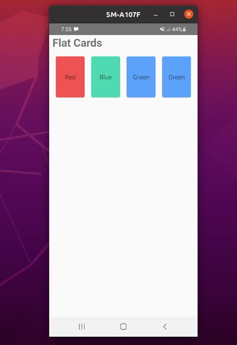
Quick look:
This code is a React Native component that creates a layout with "Flat Cards". The component starts by importing the StyleSheet, Text, and View components from the react-native library, as well as the React library.
The component is then defined using a functional component named FlatCards that returns a view with the heading text "Flat Cards". The heading text is styled using the headingText style from the styles constant.
The component then creates another view, with the container style from the styles constant, which is used to wrap the four cards that are displayed in a row.
Each card is created using a View component with the card style, and the color of the card is determined by one of the three styles cardOne, cardTwo, or cardThree.
The styles constant is created using the StyleSheet.create() method and contains the styles for the heading text, container, and the cards. The styles include font size, font weight, padding, margin, background color, and layout properties.
output
Flex Direction:
column(default value) Align children from top to bottom. If wrapping is enabled, then the next line will start to the right of the first item on the top of the container.rowAlign children from left to right. If wrapping is enabled, then the next line will start under the first item on the left of the container.column-reverseAlign children from bottom to top. If wrapping is enabled, then the next line will start to the right of the first item on the bottom of the container.row-reverseAlign children from right to left. If wrapping is enabled, then the next line will start under the first item on the right of the container.