

In React Native, the "StyleSheet" component is used to define styles for your components. It provides a way to separate the style definitions from the component code, making it easier to maintain and reuse styles across the application.
Styles in React Native are defined as JavaScript objects, and the "StyleSheet" component provides a convenient way to create these objects. To define a style, you call "StyleSheet.create" and pass an object that defines your styles.
The styles you define in a "StyleSheet" can be applied to components using the "style" prop. You can apply multiple styles to a component by passing an array of style objects to the "style" prop.
Example:
import React from 'react'
import{
    View,
    Text,
    StyleSheet,
    useColorScheme
} from 'react-native'
function AppPro():JSX.Element{
    const isDarkMode =useColorScheme()=== 'dark'
    return(
 <View style={styles.container}>
    <Text style={isDarkMode?styles.whitetext:styles.whitetext}>Hello World</Text>
 </View>
    )

}

const styles=StyleSheet.create({
    container:{
        flex:1,
        alignItems: 'center',
        justifyContent:'center'


    },
    whitetext:{
        color:'black',

    },
    darkText:{
        color:'#000000'
    }
})
export default AppPro
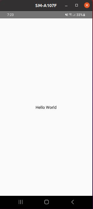
output:
alignItems: justifyContent:
alignItems and justifyContent are props in React Native used to position and align elements within a container component.
alignItems (left-right)is used to align elements vertically within a container. Possible values include:
flex-start(default) aligns items to the top of the containercenteraligns items to the center of the containerflex-endaligns items to the bottom of the containerstretchstretches items to fill the container
justifyContent (Top-bottom)is used to align elements horizontally within a container. Possible values include:
flex-start(default) aligns items to the start of the containercenteraligns items to the center of the containerflex-endaligns items to the end of the containerspace-betweenspaces out items evenly, with the first item at the start and the last item at the endspace-aroundspaces out items evenly with equal space around them
Both alignItems and justifyContent are used to control the layout and positioning of elements within a container component, typically a View component with the flex style.